our cork stoppers match your wine
Amorim Cork Stoppers

branding, design & communication
a new chapter in the history of Share IT
Share IT is celebrating a decade of specialised consultancy in technological nearshore. Its cutting edge vision and heavy investment in specialisation has allowed it to position itself over the years in the international market as a company that allows IT and marketing departments to hire a highly skilled development team which is tailored to each challenge.
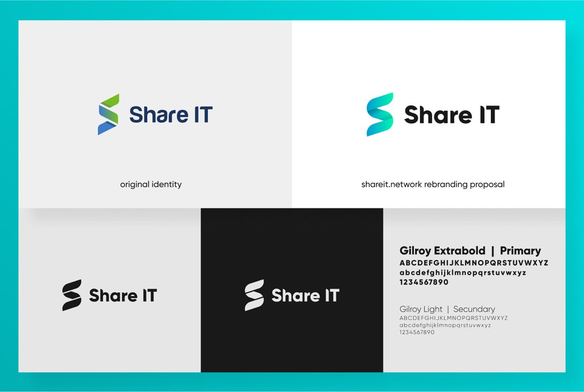
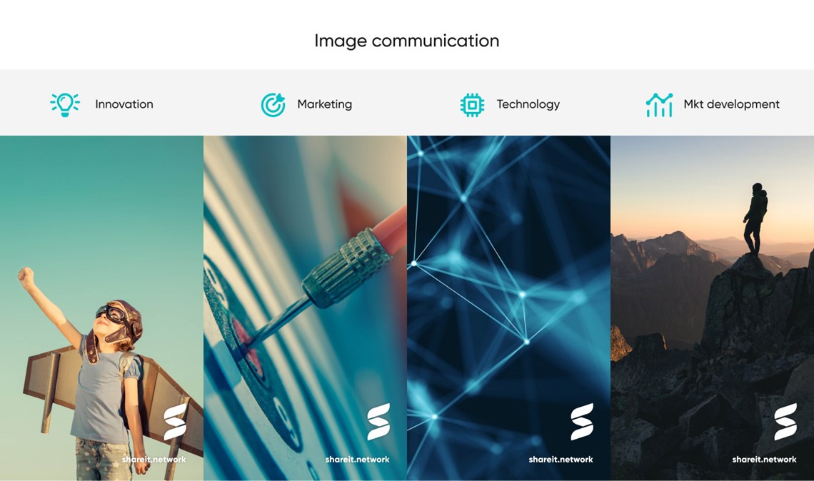
In 2021, Share IT turned over a new page, affirming itself as a group of companies specialised in innovation, marketing, technology and software development. At this point we were challenged to update the DNA of the brand, with a new identity that would mark a new Era.
Our starting point for this branding process was the letter ‘S’, also previously featured in the logo. The fact the letter remains in the logo transmits the idea of the evolution of the branding of Share IT.
Through the colour gradients blended into the Share IT logo, the letter ‘S’ was redesigned as a more curved and continuous line, resulting in a more contemporary image, in step with a technological and modernised vision, with a visual idea of infinitude (reflecting the intention of Share IT to continue to reinvent itself and stay ‘ahead of the curve’ over time).
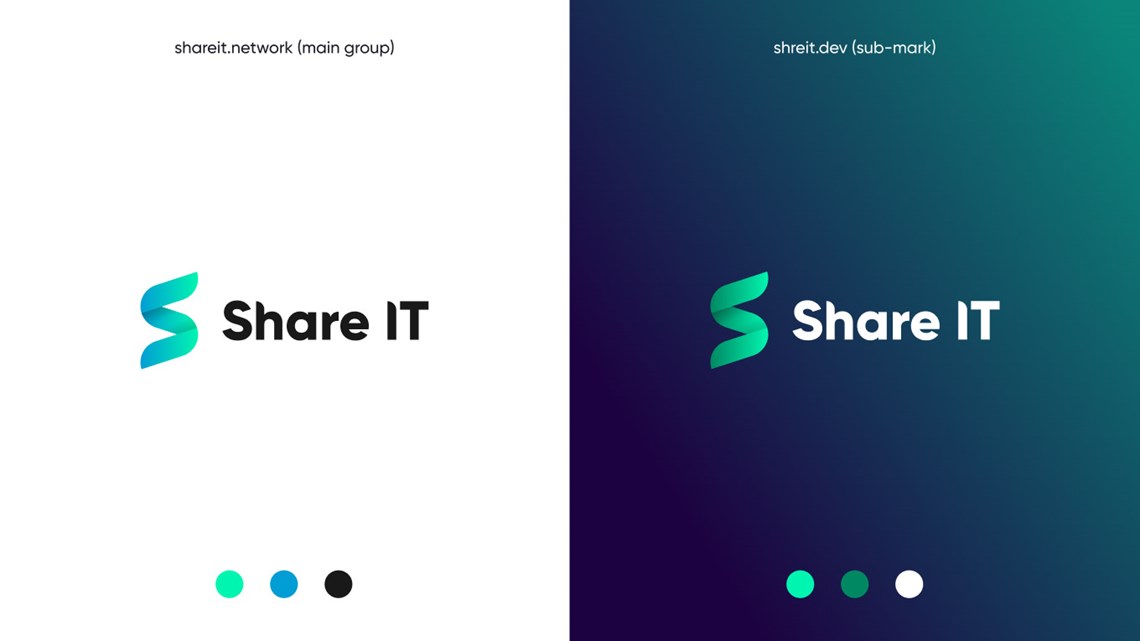
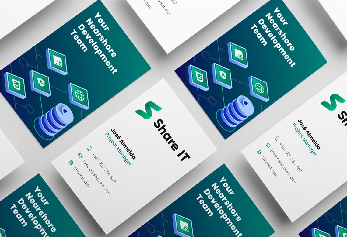
After defining the outlook of the new image, two variants of the logo were implemented to allow a clearer communication of Share IT as a business group and Share IT as a nearshore company for software development.
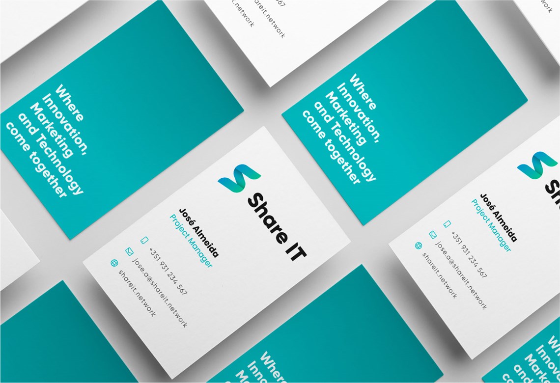
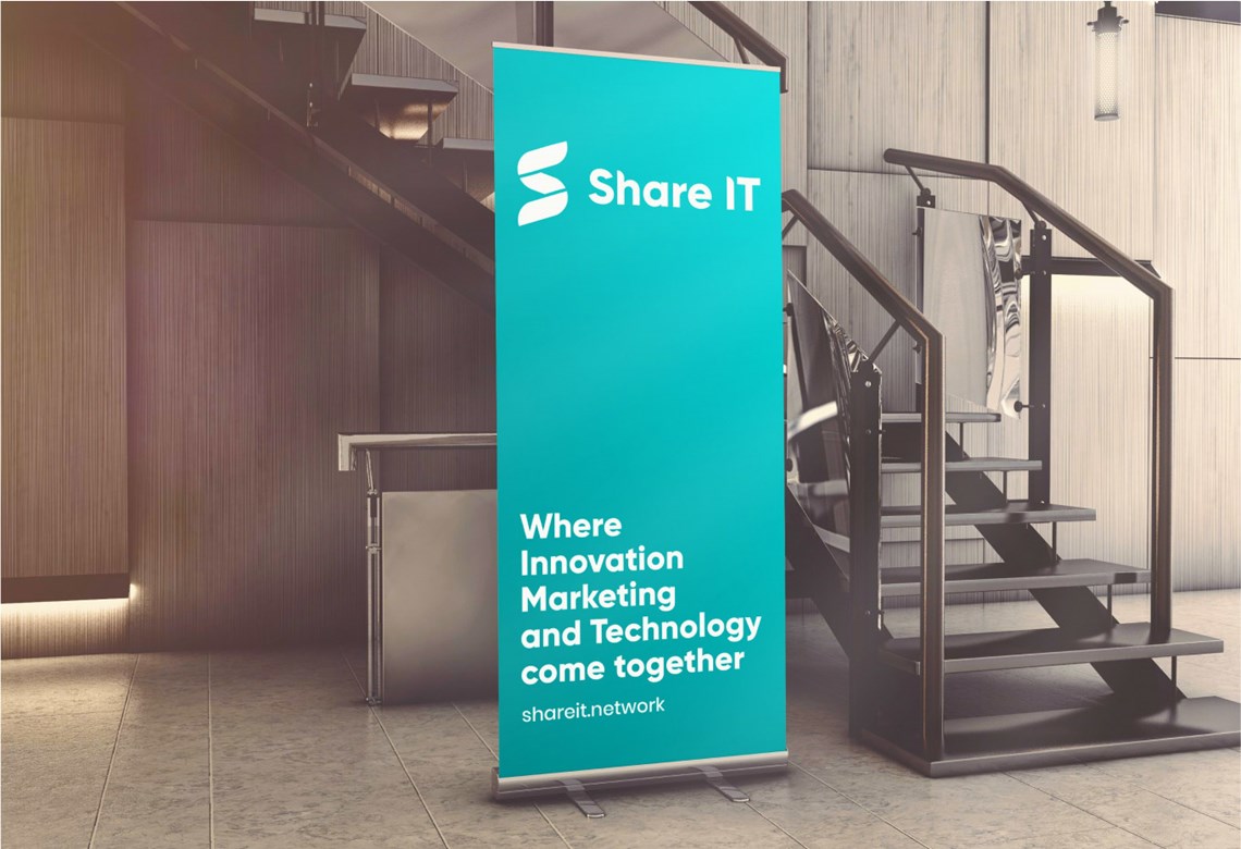
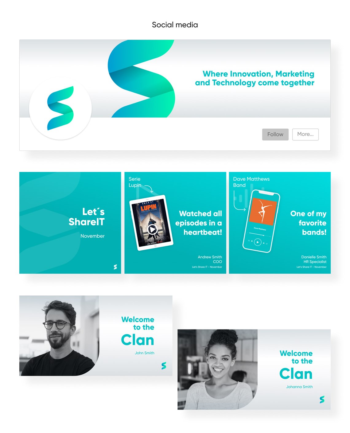
The end result is a new identity, present on its website, social media and merchandising. A landmark for its 10 years of activity and its new chapter as a group.
